Patient Safety CommunityPatient Safety Community is a growing network of professionals dedicated to helping people live better by advancing systems thinking, human factors engineering, and collaborative learning in the healthcare sector.
Editorial Writing on SubStack
Brand Identity
Organizational Development
Social Media Content
From Founder's Vision to Brand Identity
Identity Development
After nearly a decade of building Patient Safety Community, founder Dr. Chris LeMaster envisioned a brand that would connect the siloed communities within healthcare.
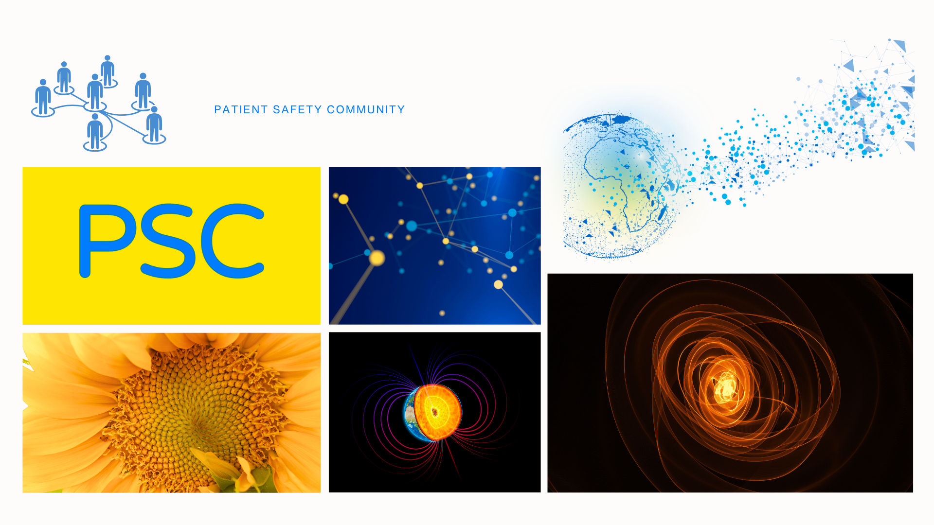
Our early discussions explored Patient Safety Community as the Earth's core, a central force connecting the broader healthcare ecosystem. Nature became an important source of inspiration, particularly mycelial networks and the intricate systems of connection and interdependence beneath the Earth's surface. The challenge was to translate this organic, interconnected vision into a visual identity that felt both credible from a healthcare perspective and something fresh.
Discovery & Direction
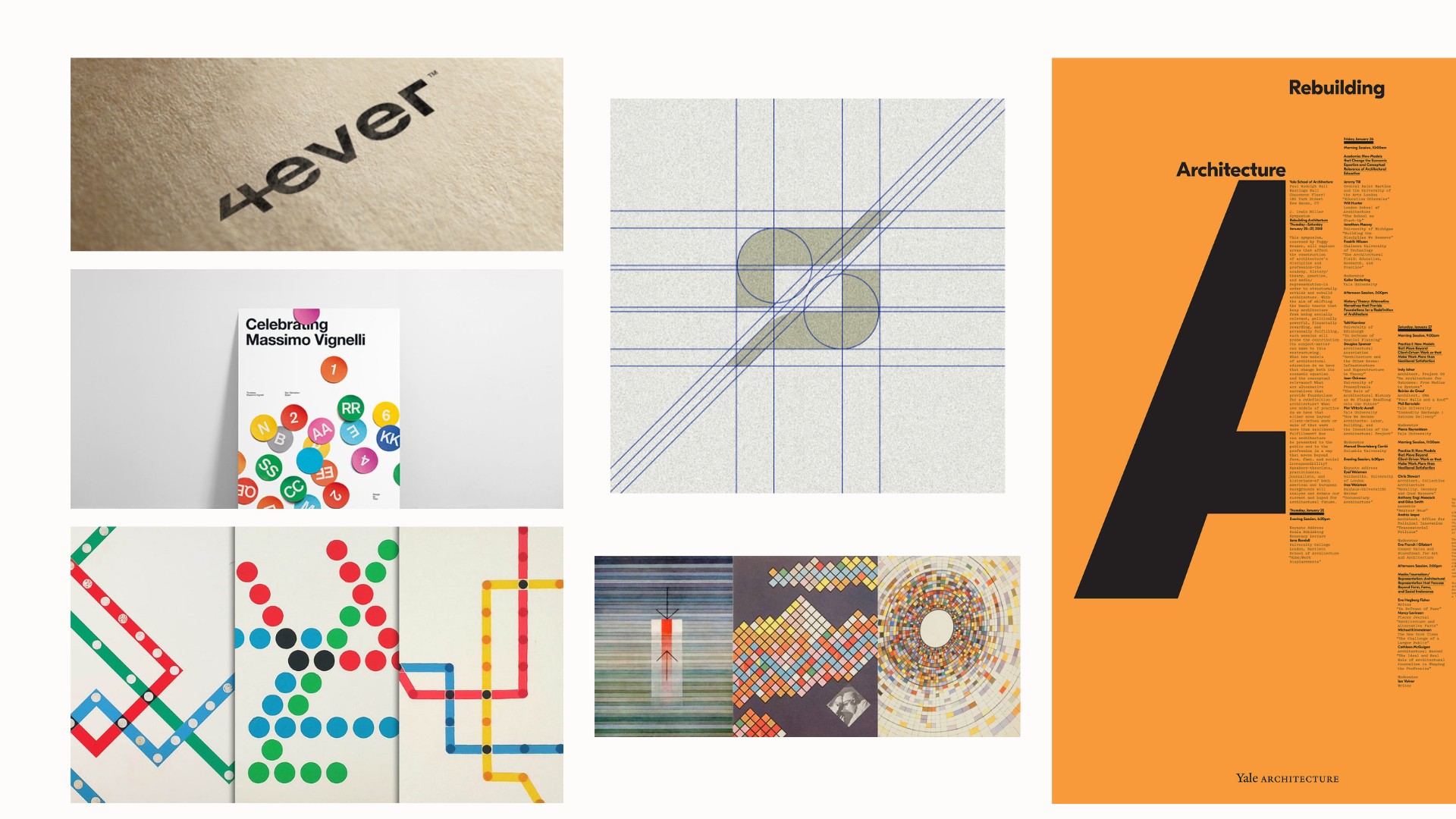
Building on these foundational concepts, we explored interconnected shapes, organic forms, and circular geometries to visually represent the relationships within we were trying to create from within the PSC.
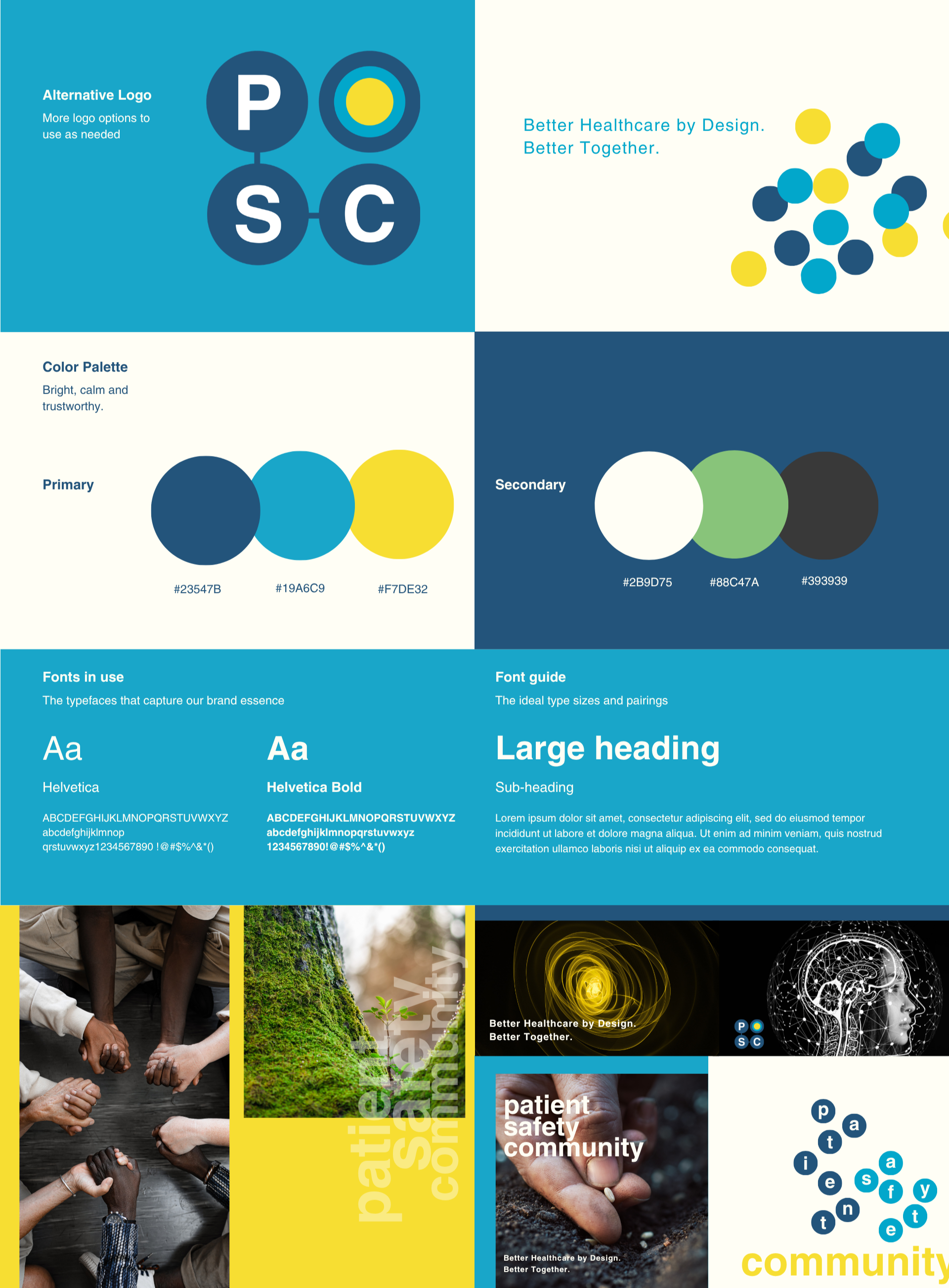
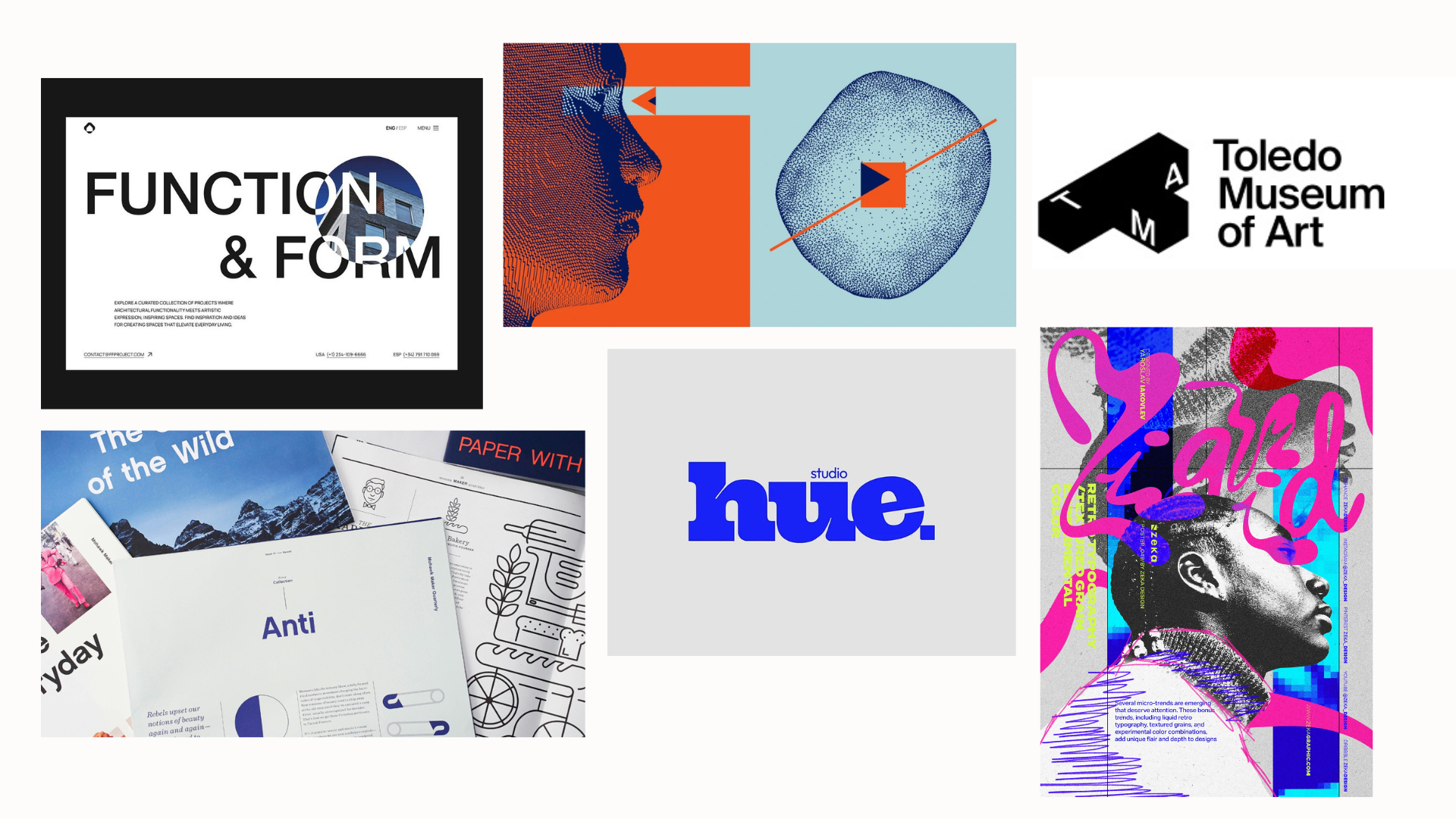
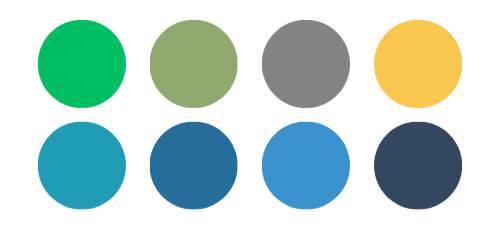
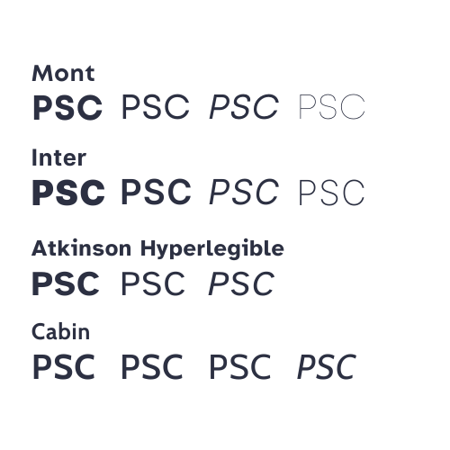
Our design exploration focused on balancing trust, innovation, and approachability. We prioritized a natural, welcoming color palette and bold sans-serif typography to establish a modern, recognizable identity.
We also refined the brand's naming convention, prioritizing PSC for its simplicity and memorability while retaining Patient Safety Community as an interchangeable expression of the organization's identity.
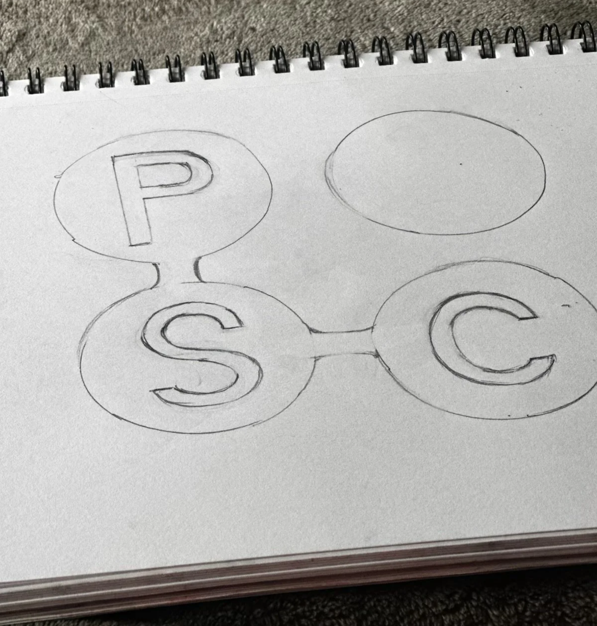
The Aha Moment
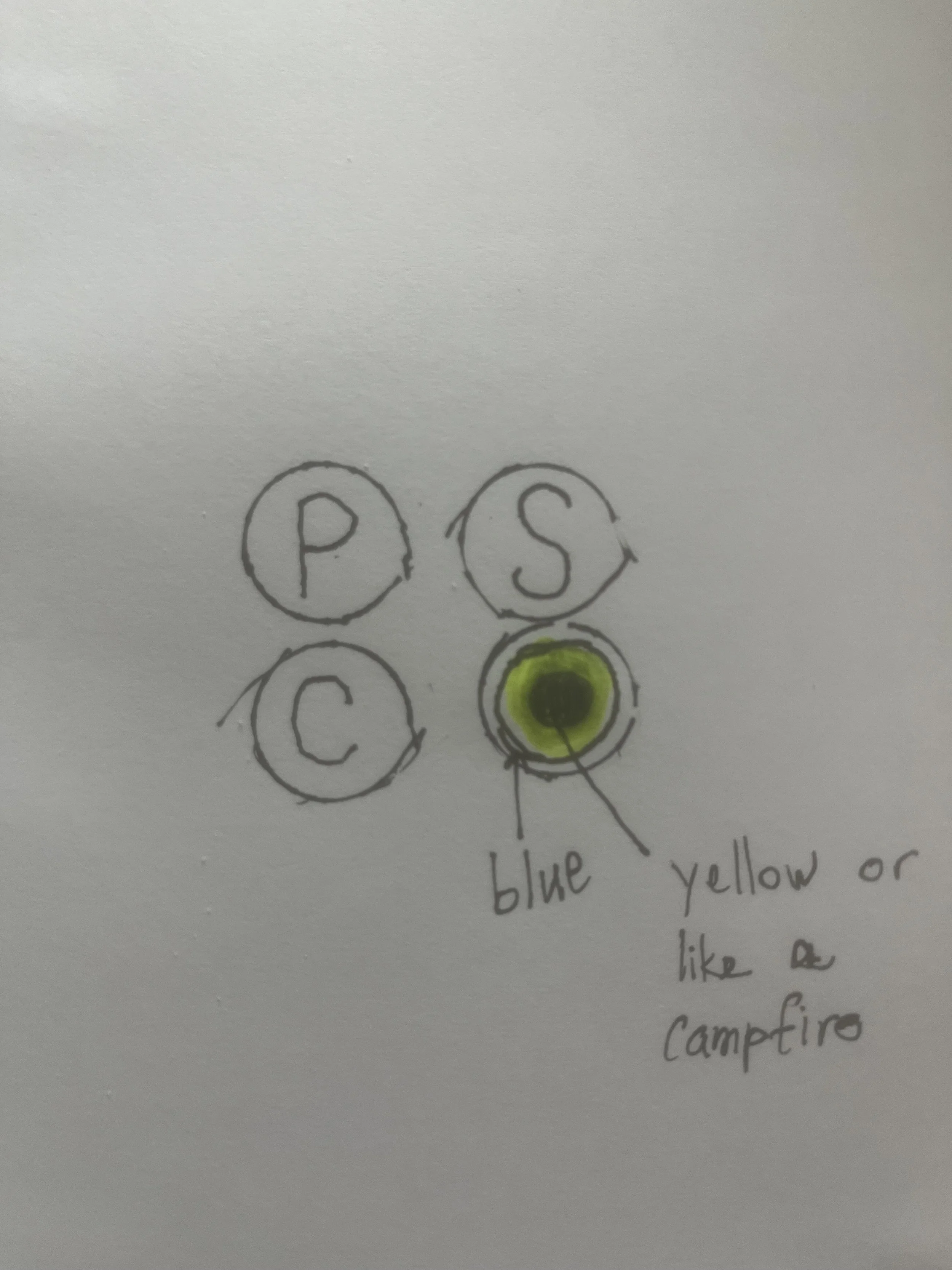
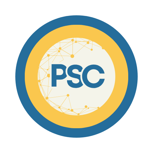
After six months of exploration and refinement, we found it. With a few final color adjustments, the identity began to tell a larger story about connection.
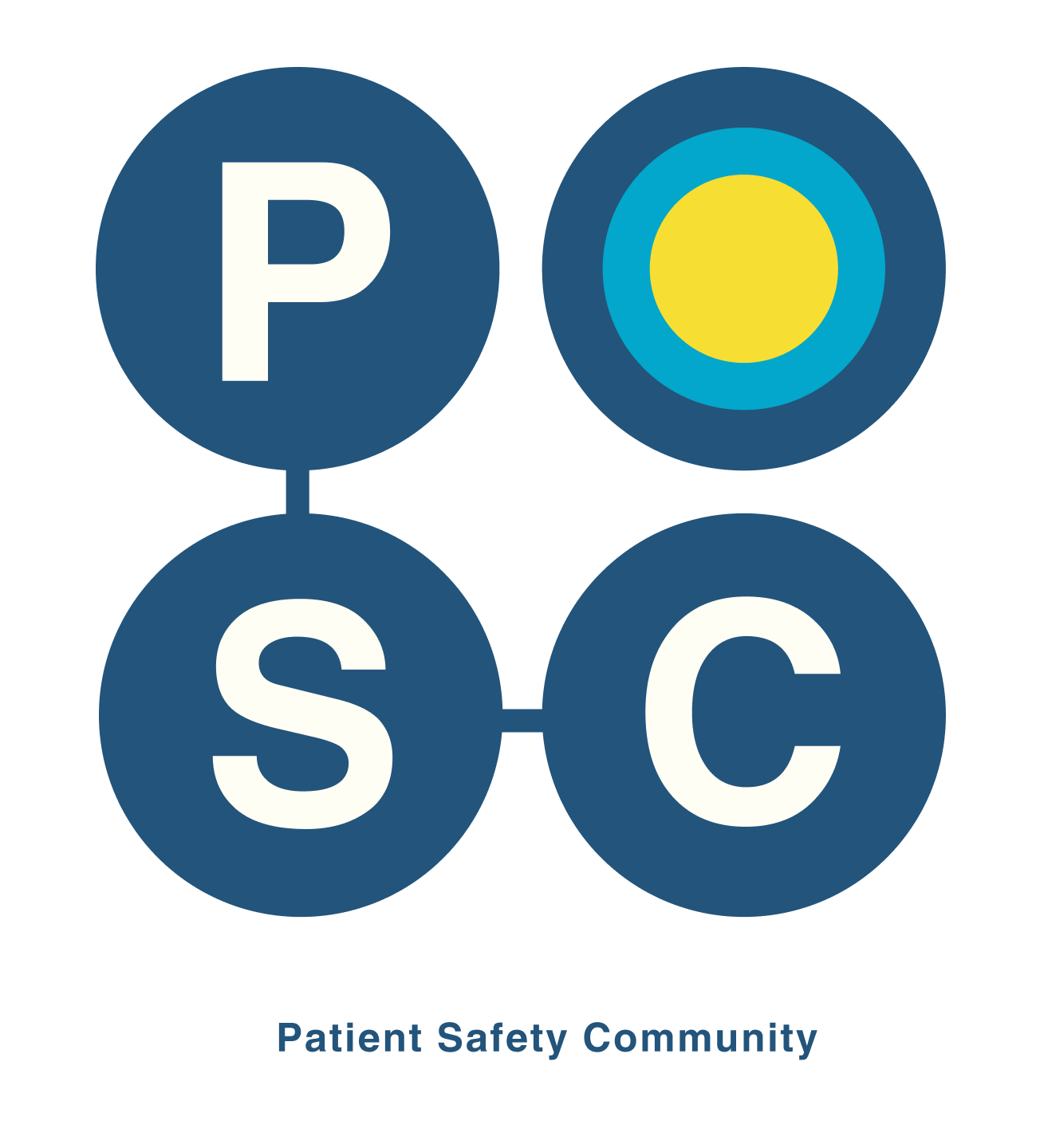
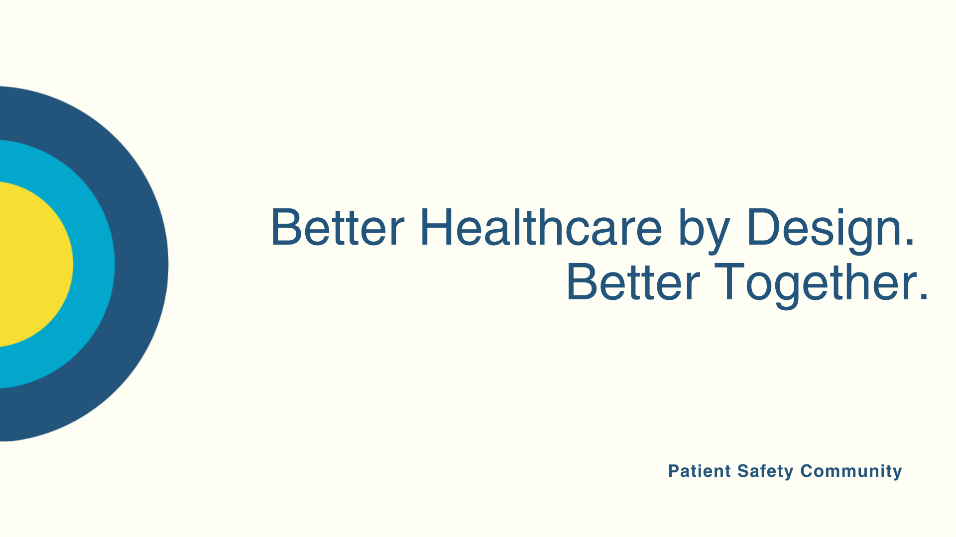
The three concentric circles represent that vision: yellow symbolizes Patient Safety Community at the core, the middle ring represents the often-siloed groups within healthcare, and the outer ring represents solutions waiting to be deployed.
The long-term vision? For every circle to eventually turn yellow, symbolizing a fully connected healthcare ecosystem working together to improve lives.